


Luxurious, by nature
Nestled in the scenic Scottish countryside three miles from Dunblane, Cromlix is a luxury country house hotel, located in 34 acres of secluded woodlands and landscaped gardens with its own chapel, private loch and tennis court.
EMILY SHIELDS HEAD OF SALES & MARKETING, CROMLIX
LUCY MUTCH PR & PARTNERSHIPS, FREELANCE CONSULTANT
DAN HAYTHORNE DESIGN DIRECTOR, 80 DAYS

THE CHALLENGE
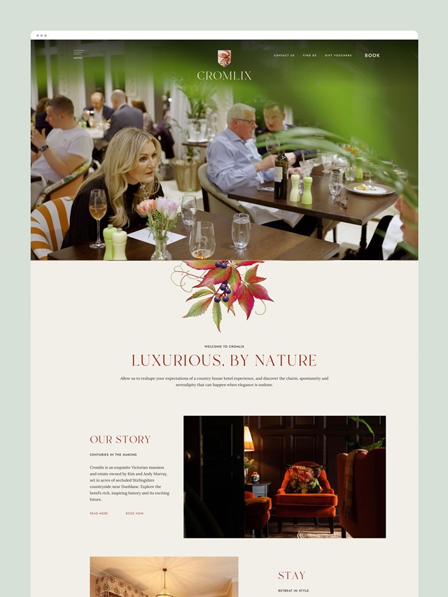
The hotel was fully refurbished in 2023, with its 15 bedrooms and bathrooms upgraded, as well as all common areas of the hotel, a new restaurant launched as The Glasshouse, a new Bar and several gorgeous private dining and meeting rooms.
However, it wasn't just the hotel in need of refurbishment.
With an abundance of energy and ideas, Kim Murray and the Cromlix team enlisted 80 DAYS to take a strategic approach to brand, visual identity and website development, supported by extensive market insight, to help usher in a new era of Cromlix.
What lead to the repositioning of Cromlix?
Emily: Well Kim and Andy (Murray) have owned Cromlix for 10 years and of course Andy was right in the midst of a very successful tennis career, so they haven’t been so involved in the day to day running of the hotel.
They’re now in a different place as a family and in where they wanted to take the business. They wanted to get much more involved themselves and for the hotel to better represent them as a couple and as a family.
So it was really a balance of maintaining the history and heritage of the house, while moving it forward. It had a slightly older, country-house, feel to it and they wanted to bring it to the next level. By taking it back to being independently owned and independently run, they had a lot more say in the direction of things.
Lucy: From a design perspective, it had last been looked at around 10 years ago. Of course, a brand can really age in 10 years and Kim, with her artistic eye, felt that the existing logo and positioning just didn’t reflect the brand today. Certainly, having visited myself before the refurbishment, the design and collateral in the hotel was quite dated and not really fit-for-purpose anymore. It didn’t feel 5-star luxury and really needed an upgrade. Everything, across the board, needed refreshed.

What was the vision for a ‘new’ Cromlix?
Emily: There's always been a really fond following for the hotel. It wasn’t that people weren’t having a lovely experience when they visited, but it was perhaps somewhere you got dressed up for, to celebrate a special occasion. It wasn’t somewhere you’d just pop to for coffee or lunch with friends after walking the dog!
We wanted to change that and broaden the market appeal. We wanted it to be a place you’d pop out to because it was a glorious day. You might be out for a walk, with your jeans on, but you could still pop in for a coffee or a bite to eat, so much more of a relaxed luxury approach.
Dan: Well, I’ve got an interesting perspective in that Cromlix is almost my local, I live just down the road from it. Having lived in Dunblane for 12 years or so, I’ve seen the hotel through this period and so had my own perceptions of the target audience, those who would typically frequent Cromlix. For me, it was really interesting to understand where Kim wanted to take it as a hotel, as a product. I was perhaps one of the target audiences for the updated product, so it gave me a unique insight into the project and ultimately helped to drive the creative process.

How did research help to shape the new positioning?
Emily: The research was especially helpful at showing us where there were potential gaps in the market. It helped us to understand what was really important to people and what we had as USP’s that we could really build upon.
It quickly became apparent that we should be emphasizing the space that we’re in, the landscape, a country-house set in beautiful grounds. Also, the location, an hour from Edinburgh and Glasgow; there’s no need to drive 4 hours North to escape the city.
Dan: I would add, from my point of view, was the scale of the property and offering was important too. There’s an intimacy to the fact that it doesn’t have a couple of hundred bedrooms like some of the competitors. They may offer similar things, but not on the same scale as Cromlix. Cromlix really brings that intimacy, cosiness and a warm family feel.
The research showed that the audience really wanted a country-house hotel experience, where they could enjoy the scenery while relaxing and spending time in nature. Of course, the Cromlix grounds and estate offers that in abundance.
Emily: Definitely. We often say that with Cromlix, although it’s a hotel, you do really feel like you’re staying at someone’s house. A very nice home-away-from-home!
You’re not faced with a huge, impersonal, reception when you first arrive. Every single room is completely unique, the shape, the style, the colour schemes but all now with the common thread of bringing the outside in. All centred around nature, wellness and being. We didn’t want to become another big resort hotel with an overabundance of activities, it was more about just coming and being, enjoying the space and the quiet.
That contrast between being really luxurious, but never stuffy was also really important to us and to those we surveyed. We needed to make it clear that you can come in, wearing your jeans and just sit and enjoy these beautiful spaces, never feeling like you’re on ceremony or unwelcomed. Completely accessible, part of the community, and open to all.

What influenced the new visual identity for Cromlix?
Dan: Well, as we progressed through the project and tried to articulate what the essence of the brand really was, that’s when we came up with the phrase ‘elegance, undone’. That was the central feeling or theme that people should experience through the brand.
So essentially, we needed to convey a fresh, natural, effortless take on the quintessential country-house experience. It really is about the elegance, but, as you say Michelle, not being on ceremony while you’re there. You can be relaxed and comfortable in this intimate setting.
Also, going back to one of the brand pillars of being inspired by nature, the interiors are very bold in style, but with floral patterns so as to reflect the brand. Even down to the room names, all based upon the flowers surrounding the hotel.
Emily: Yes, and adding some playfulness into it all too. From the artwork, a lot of which is from Andy’s private collection, to the little touches here and there. The Damien Hirst, the skulls made out of snooker balls; they all add that little bit of quirkiness.
Of course though, the core theme and what really influenced the visual identity work and the colour palette, has been the outdoors – something that Kim is especially passionate about.
Dan: And that was absolutely reflected in the research too. There was a real authenticity and seamlessness in aligning the visual identity with the newly refurbished hotel and what people were actually looking for; the outdoors, nature and the countryside setting.
That really helped to confirm that the aesthetic of the hotel, and the creative work, was going to be well received. Right down to the new logo, inspired by the Virginia Creeper that adorns the building.
Emily: There was a real moment of ‘yes, that’s amazing, it’s absolutely the design route we want to take’; it aligned so well with what the research showed as well as Kim’s creative vision for the hotel.
We retained the link back to the history and heritage by retaining the crest and coat of arms from our old logo, but updated to include the Virginia Creeper and new colour palette, the new logo has been given a much more contemporary feel. Ready for the next stage in Cromlix’s journey.
Dan: Yes, it was important part of the process, centring in on ‘elegance undone’ and how we help Cromlix have that visual distinction when compared to competitors. Standing out and becoming known for that logo, but in an authentic way.
Holding on to the crest shape, maintaining that from the original logo, but adding a modernity to it through the use of the illustration has really helped to bring the brand up to date. The typeface still has a traditional feel to it as a Serif, but again the way we’ve treated it gives it a really classic, elegant, feel.

Has the new brand helped to steer your marketing activity?
Emily: Absolutely, having really strong brand guidelines makes all the other decisions we have to make so much easier. We now have that core foundation; exactly what we stand for and represent. Now we’re always questioning, does this support our brand, does it work as part of our story?
The tone of voice has really helped too. We’re much more conversational, more personal, more inspiring in tone as opposed to being a little more distant before. There’s much more connection with our guests now and it’s a much better reflection of the new positioning of the brand.
Dan: Yeah, the idea was to ‘always engage’ and draw people in, being very positive, with energy, love and passion for what we do. We wanted to spark the imagination of the people we’re talking to and get them to engage with this ‘elegance undone’ theme.
How well do you feel the new website reflects your new visual identity?
Lucy: One of the key things that Kim always felt was that the website didn’t reflect the life within the hotel. There’s so much more movement, colour and vibrancy in the hotel now and that’s what she wanted the website to reflect; that it’s an alive building and always something going on. The new website is a much better reflection of this.
Emily: It’s certainly a big step forward for us as a brand and much more aligned to the hotel and it’s new positioning within the market.
Dan: Of course, we have to think technically about best practice and creating great user experiences, but when it comes to the visualisation, we also have to get across the product and allow the hotel to shine. Even just the navigation as you scroll down the pages, they’re brought to life through the animation of the Virginia Creeper unfurling as an organic, living, thing along with a subtle change of colour to give a nod to the changing of the seasons. That helps to express some of that life, as well as being a visual touchpoint for the ‘luxury by nature’ theme.
How have you found working with the 80 DAYS?
Emily: It’s been a lovely experience working with Dan and the team.
Where you really came into your own was on those brand days. It was a full on few days and everyone was pretty knackered by the end of it! But it was such a positive experience and so helpful to take us through that journey. Starting from knowing we wanted something different but not being sure exactly what, to that exciting moment of ‘oh we really love this’ and where we are today. Throughout, we had that reassurance from David that although it may have seemed overwhelming in places, the end result would be worth all the effort. And it absolutely was.
It helped us all to realise that we’re all going in the same direction, to uncover what we were all looking for. It gave us a really lovely platform to explore and bounce ideas.
That was the most important part, getting that research and positioning right. It’s shaped everything else, including our beautiful new website.
Dan: Thank you Emily. It was very much a team effort from both sides. Everyone came at it from different angles and were more than happy to express themselves which was absolutely ideal for us. It definitely helped contribute to the end result we see today.
Looking to evolve your hotel's brand, visual identity or website? We'd love to chat.